| POSITIVE AND NEGATIVE SPACE IN ART |
 |
|
The concept of negative space (and the inevitable positive space that accompanies it) is an important one to grasp as an art maker. Though these days it is most often discussed in photography circles, the use of negative space to the artist's advantage has been in practice for centuries, in the fields of painting, drawing, and, more recently, digital design.
|
SUMMARY
| WHAT IS IT? |
COMPOSING IMAGES |
IN DIGITAL DESIGN |
IN FRAMING |
| Negative space is the area surrounding the subject of an image which defines the lines of that subject. |
Negative space serves many purposes, including drawing focus to the subject, visual deceptions, and evoking feelings in the viewer. |
Logos and solid color digital designs make great use of negative space, hiding secondary images in the main picture and creating simple but significant images with just a few colors. |
Too little negative space in a framed image can result in the subject being reduced to mere lines and shapes. Too much negative space and the subject appears to float. Window mats are a good way to control negative space in a framed image. |
|
| WHAT IS NEGATIVE AND POSITIVE SPACE?
|
 |
|
Simply put, negative space is the part of an image that is not filled by the positive space - the subject. Most often, negative space is relatively uniform - a solid color or background, or accompanying images blurred by a shallow depth of field. Because this "empty" space is in direct contrast with the busyness of the subject, it serves to define that subject.
As you can probably guess, then, negative space exists in every representative image. The only cases where one might argue an absence of negative space is a patterned or abstract design, where differentiation between positive and negative space is not possible.
When the concept is discussed artistically, however, it usually goes beyond the fact that it is always there. Rather, artists are considering the use of that ever-present area - as a statement, to draw focus, or to deceive the eye.
|

A good example of negative space
|
| IMAGE COMPOSITION
|
 |
DRAWING FOCUS
Because negative space is almost always present, photographers (we'll focus on them in this case) do not have to "create" it, but they can certainly compose their images to make use of it in a pleasing way.
Think of almost any image you've ever seen of an insect or bird, pictured close up. Chances are, the creature is surrounded by a fuzzy green or brown background that used to be leaves or branches, but was reduced to a few simple colors by the artist's use of a shallow depth of field. This is a good example of using negative space to focus the viewer's attention. You won't be looking at anything but the ladybug, because there's nothing else but negative space to look at!
Placing anything against a blue, white, or black sky is a good way to utilize negative space and draw attention to your subject. Likewise, a blank wall or plain backdrop; think of every studio family photo ever taken - you're never distracted by background images because there are none.
Generally, photographers decide whether they want to compose the image to have mostly negative space (a tiny tree in the corner, with the sky behind) or mostly positive space (the tree large in the foreground, with blue just peaking through). Balancing negative and positive space is often seen as less visually pleasing, but can also be used to the advantage in some instances.
Removing almost all negative space can also create an interesting visual effect. Consider the image of the ship shown at the right.
TURNING THE TABLES
Consider an image of your hand, held up to a flawless blue sky. Regardless of how much of the image your hand takes up, the surrounding blue sky will be the negative space, right?
Actually, not necessarily. If you take the picture so your hand is in the bottom left corner, with the sky spreading out across the remaining 3/4 of the image then yes, the sky is the negative space. But imagine if you placed the hand in a more central position, taking up 3/4 of the image, and instead of adjusting the light so the viewer can see all the lines and creases of your palm, under exposed that section into a silhouette to make the blue sky really pop.
In such a case, an argument may arise as to which part of the photograph is the negative space, and which is the positive. You have a black hand shape against a blue sky. Because we recognize the hand as a potential subject, we probably relegate the blue sky to the background. But in the case of two basic colors - especially when one is black, a common negative space color - the distinction becomes a bit murkier.
It is in this way artists can use negative space to play with our perceptions.
EVOKING A FEELING
The use of negative space will almost always draw the viewer's eye to the proposed subject (or make it wonder which is which, if that is the goal). But negative space can also be used to evoke a wide range of feelings, depending on the relationship between the subject matter and the negative space. Visualize:
- A child sitting on a hill with a vast gray sky behind them, staring toward an adult who is just exiting the image.
- A face covered by hands, lit so it appears to float in a sea of shadow.
- Just knees and feet poking out of the water, with the vast, empty lake and clear blue sky spreading around.
- A person standing on the edge of a cliff, staring out into the sky, shoulders hunched.
- A person standing on the edge of a cliff, staring out into the sky, arms outstretched.
Each of these images utilizes negative space to draw focus to the person or part of a person in the image. But though the composition is similar - small body, large world - the descriptions likely cause different feelings to surface. Number 1 might influence a sense of abandonment, while number 2 evokes despair. Number 3 might create a sense of calm, or fear, depending on how the viewer feels about water. Number 4 suggests loneliness, while number 5, though essentially the same image, evokes freedom, promise, joy.
As you can see, negative space can be used to promote a calculated emotion in the viewer.
|

Negative space: ocean

Almost no negative space

Negative space: sky
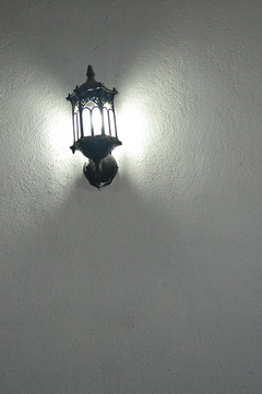
Negative space: wall
|
| NEGATIVE SPACE IN DIGITAL DESIGN
|
 |
|
Negative space is a popular tool in the graphic arts, primarily in logo design and minimalist digital artwork. The designer is often using just a few, solid colors, and will fiddle with the size of the subject and the amount of negative space around and within it.
Though lots of negative space can just be a way to keep the image clean, contemporary, and easy to reproduce (think of the Facebook logo), it can also be a great opportunity to conceal messages, alternate images, or symbols.
A much seen example which keeps the visual cue subtle is the FedEx logo. Doing nothing but choosing the appropriate font, the designer outlined an arrow - a universal sign of speed and direction, the company's desired trademarks - within the E and the X. The logo has won awards for its simple ingenuity.
Another oft-seen negative space method using just color - in both digital design and painting - is the creation of mirrored silhouettes which form two shapes between which a third shape is created in the opposing color. Two faces that form a vase in their negative space is one of the most common examples.
|

The negative space around the ice cream cone defines the shape
|
| BALANCING NEGATIVE AND POSITIVE SPACE IN FRAMING
|
 |
|
Even if the image itself was not composed with negative space in mind, picture framers should keep some basic things in mind when preparing to frame a photograph or other representational image.
In picture framing, the negative space is provided by two things: the natural background of the image, and the window mat that often bridges the gap between frame and photo. The subject of the artwork, and any decoration that might be added to the mat, are the positive space.
A balance between negative and positive space should be achieved so the art is commanding most of the attention, while the blank space goes unnoticed. Keep in mind, balanced does not necessarily mean equal, and unnoticed definitely doesn't mean unimportant.
The negative space around the image, whether created by the rest of the photo or the mat, is essential to define the image. This was mentioned in the definition at the beginning of this article, but it is a significant concept. Take a look at the framed image (A) on the right. Though a close study might make it clear this is a car, with no negative space around it and bordered immediately by the frame, it more closely resembles a random geometric array of lines. There is too little negative space in this example.
Now consider the second image (B). We can now clearly see the image is a car, because the negative space surrounding it is able to define the shape. But it is also clear the car is the subject or focus of the image, since it takes up most of the space. There is some healthy "visual tension" between the object and the background. There is a good amount of negative space in this example
Finally, take a look at the third image (C). The abundance of negative space surrounding the car has become distracting. The car appears to float, unattached to reality or any visual anchors. There may be too much negative space in this example.
Whether the negative space in your framed image is created by the image itself, or the surrounding mat, it's important to consider the consequences of whatever style you choose.
Browse our frames, and place your order today: Picture Frame Mouldings.
Choose a mat color and thickness from our great selection: Custom-cut Matboards.
|

Image A
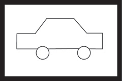
Image B
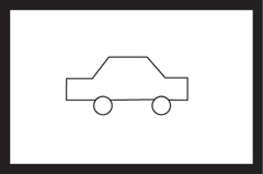
Image C
|
|
At KeenART Media, we have years of experience framing artwork in the most flattering way. We'd be delighted to help you make the most of your beautiful image with a great frame, fast service, and decades of quality display.
If you have questions about any of our services or products, don't hesitate to contact us. Our knowledgeable staff is always happy to assist with answers, advice, or suggestions.
|
|
© 2002-2026 - KeenART Media Ltd.
|
|
| |
|
